
- Why Resource Dashboards Matter for Contractors
- 1. Crew Hours and Labor Utilization
- 2. Equipment Status and Utilization
- 3. Job Progress by Phase and Cost Code
- 4. Overtime Hours and Premium Cost
- 5. Labor and Equipment Availability
- 6. Backlog and Near-Term Capacity
- 7. Budget Impact and Cost Variance
- How to Set Up a Dashboard for Fast Decisions
- Where the Data Should Come From
- Table Overview: Planned vs. Actual Resource Performance
- Table Overview: Backlog, Availability, and Budget Impact
- Conclusion
- FAQs
- Related Blog Posts
Sooo…you’re staring at your construction resource dashboard. For two hours now!
It’s supposed to save you time, right?
It’s supposed to give you an at-a-glance, actionable summary on what’s happening in the field—but it’s giving you so much data you’ve now spent longer decoding it than your least productive guy has spent on his phone today. And you’re the one tracking his productivity…
You’re about to give up and just let things be—besides, your numbers are still green, technically, last time you checked.
But don’t quit just yet. It can be the difference between catching a labor overrun in week two and explaining it to your client in month six.
Unproductive field labor is estimated at 11% to 15%, equipment idling runs about 38% to 40% of engine hours, and many teams target 8 to 12 months of backlog.
The real secret to maximizing a Construction Resource Dashboard?
Keep it simple.
You don’t need to know everything! It will just give you a headache.
The strongest dashboards stay narrow. They use a small set of KPI cards, clear red-yellow-green status signals, and drill-down by project, phase, trade, and cost code.
At a glance, the dashboard should answer:
- Are crews working to plan?
- Is equipment in use or sitting idle?
- Is installed work keeping up with labor and cost?
- Is overtime cutting into margin?
- Is there enough labor and equipment for the next phase?
| Metric | What it shows | Why it matters |
|---|---|---|
| Crew hours | Planned vs. actual labor time | Flags labor drift early |
| Equipment status | In use, idle, down, on rent | Shows waste and downtime |
| Job progress | Percent complete by phase and cost code | Links spend to work in place |
| Overtime | Extra hours and premium cost | Shows margin pressure fast |
| Availability | Open labor and equipment capacity | Spots near-term shortfalls |
| Backlog | Sold work by time period | Shows future workload pressure |
| Budget impact | Cost variance and forecast at completion | Shows whether the job is making money |
Data should come from construction time card software, daily logs, schedules, equipment logs, maintenance records, and job cost reports so the numbers stay current and tied to the same cost structure.
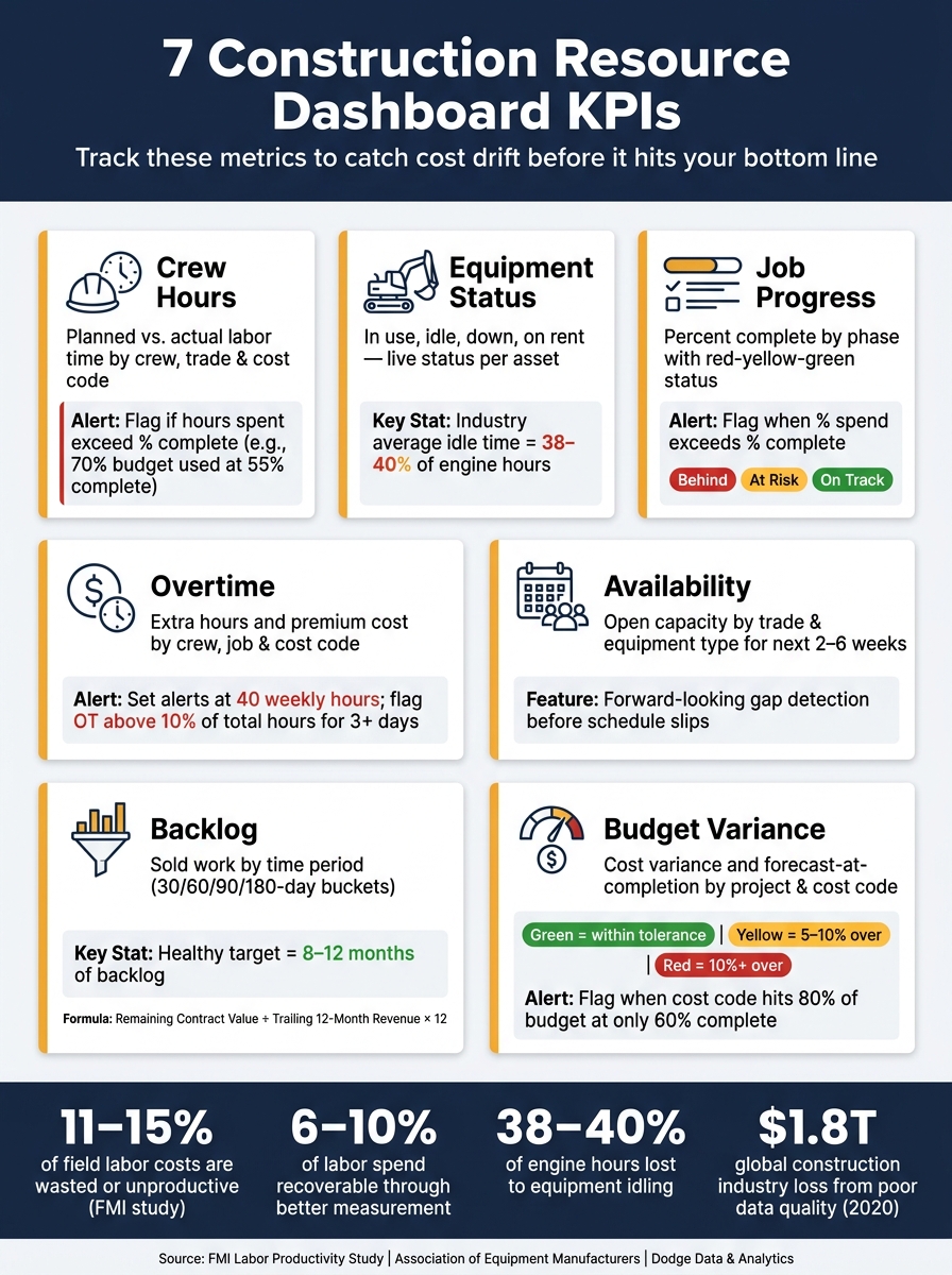
7 Construction Resource Dashboard KPIs: Key Metrics & Industry Benchmarks
Why Resource Dashboards Matter for Contractors
Most job cost overruns don’t start with one big mistake.
They build from small misses – a few extra crew hours here, an idle machine there, a cost code that keeps creeping past budget. By the time a weekly report spots the problem, the hit has already landed. A dashboard helps you catch that drift early. That’s why it needs to show a few specific metrics, not just a high-level cost snapshot.
When timecards and construction daily log software update on their own, labor cost, schedule, and budget reports stay current. According to an FMI labor productivity study, U.S. contractors estimate that 11–15% of field labor costs are wasted or unproductive, and that 6–10% of labor spending could be recovered through better measurement and management practices. Dashboards are one of the most direct ways to close that gap.
When hours and costs roll up by project, phase, trade, cost code, and date range, project managers and foremen can see exactly where trouble is starting. Say you filter by trade and cost code. You may spot labor drifting off plan, a phase running long, crews sitting idle after a handoff, or a cost code sliding past its budget without much noise. Without that setup, you’re managing by averages instead of facts. A good dashboard puts those signals front and center.
Different teams need different views.
Foremen need crew and equipment details. Project managers need cost and backlog data. The dashboard works best when all of those inputs live in one system. The next section breaks down the seven metrics worth tracking.
sbb-itb-5eea312
1. Crew Hours and Labor Utilization
Crew hours shape almost every other resource call on the job. If you don’t have a clear read on labor, everything else gets fuzzy fast—cost projections drift, schedules stop holding up, and every other number on the dashboard rests on shaky ground.
Crew hours are the baseline resource metric. Track how many hours were worked, who worked them, which job and phase those hours went to, and whether actual time lines up with the plan. Break it down by crew and trade, not just a single daily total, so you can see where hours actually went—not just that they were logged.
That’s also where utilization comes in: how much of that paid time was productive versus lost to delays, rework, or waiting around. A crew can clock eight hours and still deliver far less than eight hours of progress.
Real-Time Visibility
Your dashboard should show total hours worked today and this week, broken out by crew, trade, and individual worker.
It should also show planned vs. actual hours, live on-site headcount, and clock-in/clock-out status.
That matters in the field. If only 4 of 8 scheduled electricians have clocked in by 10:00 AM, the superintendent can shift work right away instead of losing half a day waiting for a problem to show up on paper.
Use simple status labels like “on time”, “late”, and “missing” so the crew picture is easy to scan.
Cost-Code Alignment
Every hour should tie back to the right job, phase, and cost code. That gives managers a clean way to compare actual labor against budgeted hours.
Contractor Foreman supports cost-code-level time entry through GPS-enabled mobile timecards, with supervisor approvals that help keep the data clean and current.
Forecasting Value
A good dashboard should also show forecast remaining hours by phase based on current productivity.
Here’s the kind of thing you want to catch early: if 800 of 1,200 budgeted hours are already spent and the phase is only 50% complete, the dashboard can flag a likely overrun before the phase is finished. That gives the team time to act while there’s still room to fix it.
Or take a framing crew that burned through 300 of 500 budgeted hours to get a phase 70% done. On paper that looks fine—but run the math forward and that phase is on pace to finish around 430 hours, not 500. That’s room to pull a crew member onto another job early, instead of finding out about the surplus after the fact when it’s too late to redeploy anyone.
The earlier the flag, the more options the team has. Catch it at 50% complete and you can shift labor, adjust the schedule, or have a conversation with the client. Catch it at 95% complete and all you can do is explain what happened.
Budget Impact
Hours only tell part of the story. They start to affect the bottom line hard when they roll up into cost.
Convert labor hours into dollars using burdened rates, then track variance by dollar amount and percentage at both the job and cost-code level. A five-hour overrun on one crew might not look like much on its own, but multiplied across burdened rates and stacked against every cost code on the job, small gaps add up fast—and they tend to hide in the aggregate numbers until someone drills down.
This is also where the dashboard earns its keep: a percentage variance alone can undersell the problem. Being 8% over on a $40,000 cost code is a very different conversation than being 8% over on a $400,000 one, and the dashboard should make that distinction obvious at a glance rather than burying it in a spreadsheet.
Once labor is visible, the next question is whether equipment is helping or hurting the job.
2. Equipment Status and Utilization
Once labor is visible, equipment is usually the next place costs leak.
Idle rental units, assets sitting in the yard, or a key excavator going down in the middle of a phase can throw a job off fast. A good dashboard should spot those problems early, before they turn into scheduling mistakes that cost time and money.
Real-Time Visibility
Your dashboard should show the live status of each key asset: in use, idle, down for maintenance, in transit, on rent, or scheduled for off-rent. Each record should include the asset ID, equipment type, current project, phase, supervisor, location, engine hours, and the next maintenance date and service type. Green, yellow, and red status flags help crews scan the fleet at a glance.
Industry telematics data shows that construction equipment idles for 38% to 40% of engine hours on average. That’s a big chunk of machine time with no work coming from it. When a dashboard shows idle time by asset in real time, using telematics or daily field logs, equipment managers can see that waste as it happens instead of finding it later in a report. Contractor Foreman, one of the best construction scheduling programs, can centralize equipment data with daily logs and project schedules, so field status changes appear in management views without an extra manual step.
That live view should do more than show labels on a screen. It should also trigger maintenance and scheduling alerts.
Forecasting Value
The dashboard should flag upcoming maintenance and equipment shortfalls before they disrupt the job. If a loader is getting close to its 1,000-hour service interval in the next nine days based on current use, that’s not just a shop issue. It’s a scheduling issue.
It also helps to layer equipment commitments over the project schedule. Say you need four excavators during one week and only three are available. That gap gives you time to line up a rental before the crew ends up waiting around.
Cost-Code Alignment
Every equipment hour should tie back to a project, phase, and cost code. Without that link, equipment cost just floats as a lump-sum number—present, but not telling you where it’s actually going.
That link is what makes it possible to show equipment hours and cost by phase and flag equipment-heavy work that’s starting to drift off plan. If excavation is burning more machine hours than budgeted while the phase is only half-done, that’s a signal worth catching early—not something you want to find out when the bill lands.
Budget Impact
Show budgeted vs. actual equipment cost by project, along with forecast-at-completion. Rental equipment should have its own line item. If a telehandler logs four idle rental days in the past 30 days at $400/day, that adds up to $1,600 in avoidable cost.
The Association of Equipment Manufacturers estimates that 10% to 30% of fuel used by construction equipment comes from nonproductive idling, and that telematics can cut that by 10% to 15%.
3. Job Progress by Phase and Cost Code
The next question is this: did those labor hours and equipment costs turn into installed work?
After labor and equipment, this is where many teams lose the thread. They can see what they spent, but not always whether the work in place is keeping up with the plan.
Real-Time Visibility
Each project phase – site prep, foundation, framing, MEP rough-in, and finishes – should have its own row on the dashboard. For each one, track percent complete, start and finish dates, remaining duration, installed quantities, and hours used by phase and cost code.
A simple red-yellow-green status system works well here:
- Green for on-track
- Yellow for slipping
- Red for critical
Every entry should tie back to the job, phase, and cost code so the data rolls up cleanly and stays easy to filter.
When foremen update installed quantities and task status from the field, the dashboard can refresh during the day instead of relying on old reports. Contractor Foreman can collect daily logs and progress reports and show them in web and mobile views.
Forecasting Value
Once progress is visible, the dashboard can start showing where the job is headed.
Say a drywall cost code is 40% complete with 10,000 sq. ft. left. If the crew’s production rate points to a five-day finish, but the schedule only gives them three days, that’s an early warning. You can deal with staffing before the delay lands.
The dashboard should also recalculate forecast cost at completion for each cost code at least weekly, using actual spend and percent complete. If a code is projected to go over budget, it should show up right away – not at month-end when the damage is already done.
Budget Impact
For every phase and cost code, the dashboard should show the original budget, actual cost to date, percent complete, forecast cost at completion, and cost variance in both dollars and percentage.
If framing is 55% complete but has already burned through 70% of its labor budget, that gap needs attention fast. When this data connects back to daily logs and time entries, it becomes much easier to trace the overrun to the source – maybe unplanned overtime, a late material delivery, or a layout change that slowed the crew down.
4. Overtime Hours and Premium Cost
Once total labor is in view, the next step is to break out overtime. That’s where premium cost starts to show up.
Track overtime on its own so the extra labor cost is visible before it eats into margin.
Real-Time Visibility
Show daily and weekly overtime hours for each employee, crew, and project. Also show overtime percentage and premium dollars by job and cost code. Set alerts at 40 weekly hours and when crew overtime goes above plan. That gives superintendents time to shift staffing or move noncritical work before payroll closes.
Cost-Code Alignment
Show overtime by cost code so the biggest sources of premium spend stand out fast. Rank overtime premium dollars by cost code and compare them against the estimate. This matters because overtime often piles up in just a few activities. If you spot that early, you can look at crew size, sequencing, or subcontracting for the scope causing the overage.
Contractor Foreman links field time entries to projects, cost codes, and labor rates, so this alignment can happen automatically as foremen submit daily logs.
Budget Impact
The dashboard should show overtime premium as its own line item, separate from base labor cost and job-to-date labor spend. It should also show overtime premium as a percentage of the total labor budget for each job, so teams can see how fast margin is slipping.
Track overtime as a margin risk, not just a payroll add-on.
After overtime jumps, the next check is simple: do you still have enough labor and equipment to cover the work that’s left?
5. Labor and Equipment Availability
Overtime overruns are one risk. But the dashboard also needs to answer a simple jobsite question: Do we have enough people and equipment for the next phase? In other words, can the crew and fleet handle the work coming up?
Real-Time Visibility
The dashboard should show remaining crew capacity by crew, trade, and job. Each worker should be marked as assigned, partially assigned, or open, along with a status like on site, available, off, sick, or in training. For equipment, it should show reserved units, return dates, and maintenance blocks. Status flags by labor category and equipment type make it easier for superintendents to spot shortages fast.
Contractor Foreman can pull this data from scheduling, daily logs, timesheets, and equipment tracking into one place, so field updates get back to the office faster.
Forecasting Value
Real-time status shows what’s happening now. That’s useful, but it’s not enough on its own. The dashboard should also include a 2–6 week look-ahead that compares planned labor hours with available hours by trade. If the drywall cost code on a job needs 320 hours over the next two weeks but only 240 hours of crew capacity are available, that gap should be clear today, not after the schedule starts slipping.
For equipment, the forward view should show future reservations by asset and date, along with scheduled maintenance windows. Say a crane is booked 85% of the next four weeks. That gives planners time to decide whether to rent more equipment or move a phase.
Budget Impact
Availability gaps hit the budget directly. When the dashboard spots a projected shortfall, like not having enough operators for a scheduled phase, it should estimate the added cost of overtime, rentals, or subcontracting and show that number in dollars. Idle crews and underused equipment cost money too, so surplus capacity should show up as idle cost.
That makes the next dashboard check pretty straightforward: compare remaining work against remaining capacity.
6. Backlog and Near-Term Capacity
After you look at today’s capacity, the next step is the work you’ve already sold. Availability tells you where the gaps are right now. Backlog tells you what’s about to land and whether your current crews can handle it.
Real-Time Visibility
Show total contracted backlog in dollars, split between scheduled and unscheduled work. Then break it out by project, trade, project type, project size, and timing bucket – next 30, 60, 90, and 180 days – so it’s clear when that workload will actually hit the field.
A monthly bar chart helps people see the flow at a glance. A trade-by-trade table with embedded hours and revenue shows where the load is building.
One company-level formula is worth watching:
(remaining contract value ÷ trailing 12-month revenue) × 12
That turns backlog into months of work sold. Many commercial contractors target 8–12 months of backlog as a healthy range. It keeps crews busy without loading up more work than current capacity can support.
Forecasting Value
Once backlog is grouped by time window, compare the required crew hours and equipment days against the capacity you have in each period. If awarded work calls for more labor hours than your crews can deliver in a given window, that gap should be visible NOW, not after the schedule starts to slip.
A backlog burn-down curve helps with that. It shows how total backlog in dollars drops over time at current production rates, so owners can see when new work needs to be sold to keep staffing steady.
Cost-Code Alignment
Break backlog down by cost code and phase. That makes pressure points easier to spot.
- If one scope carries more backlog hours than the crew can cover, the dashboard should flag it clearly.
- If another scope has light backlog and a lot of open crew time, managers can shift staff or go after more of that work in upcoming bids.
Budget Impact
Backlog also gives you an early read on margin pressure. The dashboard should show the remaining margin on backlog for each project, along with projected margin on the remaining backlog based on live job costs.
If productivity is slipping on a certain cost code, the dashboard should show how that slowdown pushes work into later periods and puts more strain on capacity that’s already tight. That’s the kind of warning that gives managers time to act with overtime, crew changes, or subcontracting before the schedule forces the issue.
In that sense, budget impact isn’t just a rearview report. It’s a forward-looking decision tool.
7. Budget Impact and Cost Variance
After labor, equipment, progress, overtime, availability, and backlog, budget variance tells you the big thing: is the job still making money?
Real-Time Visibility
Your dashboard should show the full budget picture in one place: original contract value, approved change orders, revised budget, committed costs, actual cost to date, and variance by project, phase, and cost code.
Use U.S. dollar formatting with standard separators, like $1,250,000.00. Then make the status easy to scan with color cues:
- Green for costs within tolerance
- Yellow for a 5%–10% variance
- Red for anything above that
That way, a project manager doesn’t have to dig through reports just to spot trouble.
The rollup should also update as timecards, equipment logs, and invoices are posted. If the field enters data today, the budget view should reflect it today.
Forecasting Value
Don’t stop at current cost. Show where the job is headed.
Include Forecast at Completion, Estimate to Complete, projected gross profit, and CPI. CPI is earned value divided by actual cost. When CPI drops below 1.0, that’s a clear sign of cost pressure, and the dashboard should flag it right away.
A trend line helps here too. Put projected final cost next to the original budget so teams can see whether the gap is getting better or worse.
Cost-Code Alignment
Every dollar needs to tie back to a cost code. That’s how variance breaks out cleanly across labor, equipment, materials, and subcontract work.
Contractor Foreman can help keep timecards, budgets, and cost tracking tied to the same structure, especially when it syncs with accounting software such as QuickBooks.
Budget Impact
Overtime premium, idle equipment cost, and other overruns shouldn’t sit off to the side. Roll them into margin variance by cost code so the hit to the job is plain to see.
Set alerts when a cost code hits 80% of budget while only 60% of the work is complete.
Those money signals help you decide which numbers deserve the top spots on the dashboard.
How to Set Up a Dashboard for Fast Decisions
Once you’ve picked the right metrics, the next job is putting them in front of people in a way they can use fast. The point isn’t to dump every number onto one screen. It’s to show the few metrics that lead to action. Some guidance suggests keeping the display to 6 to 8 metrics so people will actually look at it instead of tuning out a crowded dashboard. That’s a smart place to start.
Set up the dashboard in five separate views: Labor, Equipment, Progress, Capacity, and Financial. Give each one its own tab, then add a shared project filter at the top so users can jump from one job to another without friction. Each tab should show only the metrics tied to that function. That keeps the screen easy to scan and cuts down on noise.
At the top of each tab, use KPI cards. Each card should focus on one metric, one time frame, and one plain status signal like green, yellow, or red. Show the current value, the trend, and the status in the same card. Then pair it with a trend line so users can read the direction at a glance.
Alerts matter because problems don’t wait for the next review.
Set them around thresholds such as:
- Overtime hours going above 10% of total hours for three straight days
- Equipment utilization dropping below 50% for more than five days
- A phase slipping more than 10 percentage points behind planned completion
- Total cost variance moving past 5% of budget
These alerts help teams spot trouble before it hits cost or schedule.
Each KPI card should also be clickable. If a project manager sees a red flag on labor cost vs. budget, they should be able to click into variance by project, then by phase, and then all the way down to individual cost codes. That drill-down is what turns a dashboard from a reporting screen into a decision tool.
A fast dashboard still depends on clean, current inputs.
Where the Data Should Come From
Every dashboard metric is only as good as the data feeding it. If that data shows up late, comes in half-finished, or gets entered three different ways by three different people, the dashboard stops helping. It starts sending teams in the wrong direction.
A solid construction resource dashboard should pull from six steady sources: mobile timecards, daily logs, project schedules, equipment logs, job cost reports, and maintenance records. Those inputs power the dashboard views for crew, equipment, progress, availability, and budget.
Mobile timecards are the base layer for crew hours, overtime, and labor cost.
They should capture:
- Clock-in and clock-out times
- Cost codes
- Pay type
- Job location
- GPS verification
Daily logs should track crew count, active phase, delays, and equipment status. Set a firm cutoff: daily logs should be submitted by 6:00 PM local time so the dashboard is up to date the next morning.
Project schedules set the baseline for planned progress. Equipment logs and maintenance records feed the equipment side of the dashboard. Those records should include run hours, idle time, operator, job assignment, service intervals, completed repairs, and downtime windows.
Job cost reports from the accounting system feed cost variance and budget impact. They should show actual labor, equipment, materials, and subcontract costs next to budget vs. actual by cost code. Poor data quality cost the global construction industry an estimated $1.8 trillion in 2020.
The hard part isn’t naming the sources. It’s keeping them connected.
Contractor Foreman helps by putting GPS-driven timecards, daily logs, scheduling, and financial tracking in one system, with QuickBooks integration. That single flow from field entry to budget report makes the dashboard much more useful when teams need current numbers, not yesterday’s guess.
It also helps to assign one system of record for each data type. Field timecards and daily logs should start in the field management platform. Job cost budgets and accounting entries should live in the accounting system. When those two layers connect through a dependable integration, the dashboard can read both without conflict, and the numbers stay lined up between the field and the office.
Those inputs should roll up cleanly into the planned-vs.-actual views below.
Table Overview: Planned vs. Actual Resource Performance
Once your dashboard inputs are clean, this table gives you a fast read on plan-vs.-actual gaps. Think of it as a one-page snapshot of resource performance. Managers can scan it, find the rows that need attention, and avoid digging into every metric one by one.
Each row should stand for either a project or a cost code, such as Framing – Exterior Walls or 03000 – Concrete – Slab on Grade. That setup makes it easier to filter by scope and catch problems at the right level of detail.
The columns should flow from planning inputs to field actuals to cost results. On the labor side, include planned hours, actual hours, overtime, and labor variance. For production, include planned quantity, actual quantity, and output per hour, measured in cubic yards, square feet, or linear feet based on the cost code. For equipment, include planned assignment, actual status – in use, idle, off site, or down for maintenance – and utilization percentage. The far-right columns should show cost impact: budgeted cost, actual cost, and variance.
| Column Group | Example Columns | What It Tells You |
|---|---|---|
| Identifier | Project, Cost Code | Which scope of work is being measured |
| Labor | Planned Hours, Actual Hours, Overtime Hours | Where crews are over or under the estimate , which can often be traced back to estimating errors |
| Progress | Planned Qty, Actual Qty, Output/Hour | Whether labor effort is converting to installed work |
| Equipment | Status, Utilization % | Which assets are working, idle, or down |
| Financial | Budgeted Cost ($), Actual Cost ($), Variance ($) / Variance (%) | How resource performance is hitting the bottom line |
Color-coding each variance column helps this table do its job fast. Use green for on or under budget, yellow for rows nearing a threshold, and red for over. That way, the table becomes a quick-scan tool that points people to the rows that need a call, not just a glance.
The next table should show backlog, availability, and budget impact.
Table Overview: Backlog, Availability, and Budget Impact
This next table moves from job-level variance to trade-level capacity. It shows how total workload stacks up against total capacity across active jobs. In plain English, this is the view that turns dashboard data into staffing calls. Use it to decide when to move crews, rebalance work, or add overtime with construction scheduling software.
| Trade | Backlog (Weeks) | Available Hours | Assigned Hours | Unassigned Hours | Overtime Hours | Projected Labor Cost Impact | Projected Equipment Cost Impact |
|---|---|---|---|---|---|---|---|
| Carpenters | 5 weeks | 1,280 hrs | 1,280 hrs | 0 hrs | 160 hrs | +$102,400 (incl. $12,800 OT premium) | +$8,640 |
| Electricians | 3 weeks | 960 hrs | 720 hrs | 240 hrs | 0 hrs | +$54,000 | +$3,200 |
| Plumbers | 2 weeks | 640 hrs | 640 hrs | 0 hrs | 0 hrs | +$41,600 | +$1,600 |
The carpenter row needs immediate action. At a glance, the table helps you spot trades that are stretched too thin and trades with room to take on more work. That matters because the point isn’t just to show workload. It’s to show whether capacity is being used well.
The projected cost impact columns make this more than a scheduling table. They turn it into a cost-control tool too. The overtime premium is called out directly in the labor cost impact column, so you can see the price of overloading a trade instead of guessing.
When time tracking, cost codes, labor rates, and equipment costs feed this table, the numbers stay current as crew mixes change.
With these tables in place, the dashboard is ready for setup and data flow.
Conclusion
A resource dashboard only helps when it connects the right dots. Crew hours, equipment status, job progress, overtime, availability, backlog, and budget impact each show one piece of the picture. Put them together, and you can spot where labor, equipment, progress, and cost are slipping off plan.
Keep the view tight, current, and linked to cost codes. The dashboard should answer questions, not add more. When a dashboard tries to show everything, people stop looking at it. When it lags behind the field, it turns into a history report. And if it isn’t tied to cost codes, it can’t show which phase is causing overruns. It can only show that money is going out the door.
From there, keep the dashboard narrow enough that crews and managers can scan it fast. Focus the main view on the metrics that drive decisions: labor hours vs. plan, equipment utilization, percent complete by phase, weekly overtime, and cost variance by project. If it takes more than a minute to read, it’s too complicated. Start small with a core set of construction KPIs on one or two active projects. Review them with field leads, then add more detail only after the basics are being used every week.
Contractor Foreman can centralize digital time tracking, equipment logs, project progress, and financial data so the dashboard stays current without manual re-entry.
FAQs
How often should a resource dashboard update?
A construction resource dashboard should update as close to real time as possible. The numbers that matter most should refresh within seconds or minutes after someone enters a change, not the next day through overnight batch updates. That way, teams can react fast when a metric crosses a threshold.
For connected financial systems on active projects, set automated pulls to run hourly. It also helps to review integrations and KPIs every month so syncing stays accurate and useful.
Who should use each dashboard view?
Each dashboard view should line up with the user’s role.
- Executives need a high-level view: portfolio health, exception alerts, ROI, and resource use trends.
- Project managers need job control data: budget vs. actuals, schedule, cost performance, and risk.
- Field staff need day-to-day jobsite info: labor hours, material deliveries, daily progress, punch lists, and site issues.
- Owners/clients need a simple progress snapshot: milestone completion and forecast to complete.
- Foremen need what matters right now: today’s crew, equipment status, and daily log summaries.
What data sources matter most?
The most important data sources are the ones that send real-time, automated updates from the field and the office. That’s what gives you a single source of truth instead of a mess of scattered spreadsheets, texts, and paper notes.
Start with data from:
- Accounting software for invoices, expenses, and payments
- Mobile daily logs for crew hours, labor costs, equipment usage, and material consumption
- Project management records for RFIs, submittals, change orders, and schedule updates
When these inputs stay current, your team can see what’s happening on the job and in the back office without piecing it together by hand.
Related Blog Posts
- How to Track Construction KPIs with Dashboards
- How Dashboards Help Track Construction KPIs in Real Time
- Real Data That Drives Residential Construction Decisions
- What Is Data-Driven Decision Making in Construction?