You might think dashboards are nothing more than boring boxes of numbers — just a fancy screen of chaos pretending to be helpful.
But it’s actually much more than that!
A well-themed construction dashboard is like a a foreman who never sleeps: it keeps everything organized — and as you know, that’s a big deal for any business, but especially in construction, where one small oversight can quickly turn into serious costs.
When the data is right in front of them, managers can catch issues early instead of discovering them after they’ve already turned into problems.
For the crew, that clarity means fewer mixed messages and less time standing around waiting for direction.
What’s more, a branded dashboard reflects your company’s identity. It tells clients, “Hey, we take our business seriously.” And in an industry where trust is everything, that first impression matters more than most people think.
Here’s how to do dashboards right:
- Align with Branding: Use your company’s colors, logo, and typography to create a consistent look with construction management software features. Save settings as JSON files for easy reuse.
- Prioritize Accessibility: Ensure high contrast for text and visuals, use WCAG-compliant color combinations, and avoid relying solely on color to convey information.
- Simplify Layouts: Group related KPIs, limit visual clutter, and use a logical hierarchy to present data clearly.
- Optimize for Devices: Design dashboards to work seamlessly across desktops, tablets, and smartphones.
- Customize Visuals: Apply consistent themes to charts, graphs, and tables, using semantic colors and clear labels for better data interpretation.
- Integrate Real-Time Data: Style alerts and updates with meaningful, consistent color schemes and ensure data accuracy.
The goal is really simple: to create dashboards that are visually clear, accessible, and aligned with your brand.
By focusing on these principles, your dashboards become tools that help teams make informed decisions quickly and confidently.
Align Dashboard Themes with Company Branding
Your dashboard should instantly reflect your construction company’s identity. When clients or field managers access a project dashboard, it should feel unmistakably yours, with colors, logos, and visual elements that align with your branding.
Add Brand Colors and Logos
Start by integrating your brand’s colors and logo consistently. Extract the primary color from your logo to serve as the foundation of your theme. Use it for navigation bars and key titles. Secondary colors can highlight accents and interactive buttons, while semantic colors – like green for success, yellow for warnings, and red for errors – help clarify data states.
Many platforms allow you to save these settings as JSON files, making it easy to apply consistent branding across multiple dashboards, which is especially helpful when managing numerous construction projects with powerful construction management software.
Typography is another key element. Match the fonts and sizes specified in your corporate style guide, and prominently place your logo in the dashboard header. To maintain clarity, logos should not exceed 156px in width or 48px in height. For background images, use a resolution of at least 1,920×1,080 to ensure they appear sharp and professional.
Use Brand-Specific Icons and Visuals
Custom icons tailored to construction metrics – like schedule progress, budget tracking, or equipment usage – can make your dashboards both functional and visually cohesive. Avoid generic visuals and instead design icons that align with your brand’s visual language.
Pay attention to widget styling as well. Whether your brand leans toward sharp, modern edges or softer, rounded corners, maintain a consistent look. For example, use a border radius of up to 30 pixels and a border width of 4 pixels . These small details contribute to a polished, professional appearance that feels intentionally crafted rather than relying on default settings.
By incorporating these branding elements, your dashboards will deliver a unified, professional experience.
| Dashboard Element | Branding Application |
|---|---|
| Logo | Position in the upper-left corner or header; keep size within 156px × 48px |
| Color Palette | Use Hex codes for primary, secondary, and semantic colors to ensure clarity and consistency |
| Typography | Follow corporate style guide for font families, weights, and sizes |
| Widgets | Maintain uniform border styles (max 30px radius, 4px width) to reflect your brand |
| Charts/Graphs | Apply brand-defined color schemes for consistent data visualization |
sbb-itb-5eea312
Focus on Accessibility and Readability
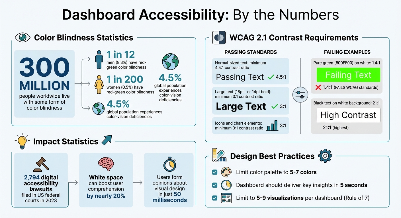
Dashboard Accessibility Statistics and Color Contrast Requirements
While having consistent branding is important, making your dashboard accessible and easy to read is just as crucial for effective communication. A visually appealing dashboard must also be legible for everyone. With about 300 million people worldwide living with some form of color blindness – including 1 in 12 men and 1 in 200 women with red-green color blindness – accessibility isn’t optional. It’s a necessity to ensure that field supervisors, project managers, and stakeholders using Fieldwire alternatives can accurately interpret construction data.
Choose High-Contrast Color Combinations
Readability is heavily influenced by luminance, or the brightness contrast between text and its background. To meet accessibility standards, aim for WCAG 2.1 Level AA compliance: normal-sized text needs a contrast ratio of at least 4.5:1, while large text (18pt or larger, or 14pt bold) requires a minimum of 3:1. Elements like status icons or chart sections must also maintain at least a 3:1 contrast ratio with surrounding colors.
For example, pure green (#00FF00) has a contrast ratio of only 1.4:1 against white, making it fail WCAG standards. In contrast, black text on a white background achieves the highest possible contrast at 21:1. Use tools like the WebAIM Contrast Checker to test your color combinations. If a pair doesn’t meet the standard, tweak the brightness or font weight until it does.
Avoid relying solely on color to communicate critical information. For instance, using a red dot for “delayed” and green for “on track” won’t work for colorblind users. Instead, pair colors with icons, labels, or patterns so everyone can distinguish between project statuses, budget alerts, or schedule updates.
Limit Your Color Palette
Too many colors can overwhelm users and make dashboards harder to navigate. As MDN Web Docs explains, “Using color to highlight important content rather than adding color to everything will have more impact and your content will be more readable”. Stick to a palette of 5-7 colors: a primary brand color, secondary accents, and semantic colors (green for success, yellow for warnings, red for errors), along with neutral grays.
This approach ensures that when you use color to highlight a critical metric – like a budget overrun or a scheduling issue – it stands out. A clean, organized palette helps users absorb information quickly and builds trust in the data. Extend this careful color selection by testing for compatibility with color vision deficiencies.
Test for Color Blindness Compatibility
Use Color Vision Deficiency (CVD) simulators to see how your dashboard looks to users with conditions like protanopia or deuteranopia. Firefox’s Accessibility Inspector is a handy tool for spotting contrast issues. Don’t forget to test both light and dark modes, as color contrast can shift depending on the theme.
For visuals specific to construction, such as heat maps or Gantt charts, incorporate patterns or textures to differentiate data series. This way, even if someone can’t distinguish between red and green bars, they can still interpret the data through other visual cues. With 2,794 digital accessibility lawsuits filed in US federal courts in 2023, designing for accessibility isn’t just a best practice – it’s becoming a legal expectation.
Design Dashboard Layouts for Usability
Once you’ve established a branded theme, the next step is to focus on the layout. A well-designed dashboard should deliver key insights in just five seconds. For construction teams juggling budgets, schedules, and safety compliance, that kind of speed can be the difference between catching an issue early or dealing with costly delays.
Here’s how to create layouts that prioritize usability and efficiency.
Keep Spacing and Fonts Consistent
Consistency in design plays a big role in how quickly your team can process information. Studies show that incorporating white space can boost user comprehension by nearly 20%. This gives project managers and field supervisors the breathing room they need to make sense of dense data. Stick to a clear hierarchy for text: use distinct font sizes for headers, sub-headers, and body text.
For layout, arrange widgets in a grid with uniform spacing. This not only connects related metrics visually but also sets apart distinct sections. Avoid all-caps text or overly decorative fonts, as these can slow down readability. Simplify numerical data by rounding values – for example, “3.4M” instead of “3,400,000.00” – to make figures easier to digest.
Once you’ve nailed the visual consistency, the next step is logical grouping.
Group Related KPIs Together
Organize your dashboard into sections like Budget/Financial, Schedule/Progress, Risk Management, and Safety/Compliance.
Grouping related KPIs simplifies navigation and reduces cognitive load.
Use an inverted pyramid layout: place high-level insights in the top-left corner, followed by trend data and more detailed metrics.
To avoid overwhelming users, limit your dashboard to five to nine visualizations. This aligns with the “Rule of 7”, which helps prevent information overload. Pair current metrics with comparison values – such as targets or previous period figures – to make the data more actionable.
Make Dashboards Work on All Devices
Your dashboard should function smoothly across desktops, tablets, and smartphones.
For smaller screens, prioritize simplicity: use larger buttons, streamlined menus, and focus on the most critical content. A superintendent checking progress on a tablet should have the same clarity as someone reviewing data on a desktop. Modular “card” designs work well here, as they allow grouped information to reconfigure automatically for mobile use without losing functionality.
On desktops, aim to fit all essential information on a single screen for quick access. For mobile devices, highlight the metrics field workers rely on most, like daily progress updates, safety incidents, or equipment availability. Tools like Contractor Foreman offer mobile-responsive dashboard themes that adapt seamlessly across devices.
Customize Widgets and Visualizations
Once your layout is in place, the next step is to ensure every chart, graph, and table aligns with your theme. This goes beyond just making things look good – it’s about creating visuals that are easy to interpret at a glance. When your colors and styles are consistent, it’s much simpler for your team to quickly grasp project updates and statuses. Apply these design principles across all your visuals and interactive elements for a seamless and cohesive experience.
Apply Themes to Charts, Graphs, and Tables
Use semantic color mapping to make data instantly understandable. For example, green can signify “on track”, yellow for “at risk”, and red for “delayed” or “over budget”. Stick to the same colors for recurring data points across all charts – if labor costs are blue in one graph, they should remain blue everywhere. This consistency eliminates confusion and speeds up decision-making.
When styling tables, apply your theme colors to headers, null values, and total rows. To make dense data easier to read, add a hover background color that highlights rows as users navigate through them. Keep grid lines and backgrounds neutral so they don’t compete with the data itself. Fine-tune elements like axisColor, gridColor, and legendValueColor to match your brand, ensuring they’re visible but not overpowering.
Follow an F-shaped visual hierarchy – place critical construction KPIs in the top-left area of your dashboard, where they’ll naturally draw the most attention. Use both regular and bold font variants for headers, labels, and values to give your visuals a polished, professional look. Don’t forget accessibility: run contrast checks on your theme colors to ensure interactive elements and text meet a contrast ratio of at least 3:1. If your brand colors don’t meet these requirements, adjust them to more accessible shades while staying true to your brand identity.
By keeping your visuals consistent and accessible, you create a dashboard that’s not only easier to understand but also visually aligned across static and interactive components.
Style Interactive Elements
To complement your themed visualizations, interactive elements like buttons, filters, and dropdown menus should also reflect the same design language. Define specific colors for different states – default, hover, selected, and pressed – to maintain a cohesive look. For instance, if your primary brand color is navy blue, use a darker shade for hover states and a lighter one for pressed states. Keep borders subtle, with widths under 4px and border radii capped at 30px, to maintain a clean, professional appearance.
Ensure your filter bar’s background and border colors align with your secondary or neutral palette. This way, it enhances your primary data visualizations rather than clashing with them. Use a consistent accent color for elements like loading indicators, selected borders, and clickable links to tie everything together.
For teams using Contractor Foreman, the platform’s mobile-responsive dashboard automatically applies these styling principles, ensuring your theme looks great on any device.
Integrate Real-Time Data with Consistent Theming
Real-time data is only useful if it aligns with your established visual theme. To ensure consistency, use predefined functional color palettes for states like Success, Warning, Error, and Info. For instance, if a project exceeds its budget, the alert should appear in your designated Error red – not a random shade that clashes with your brand identity.
Apply themes globally through tools like JSON settings to maintain uniformity across primary, secondary, and neutral colors. Standardizing interactive states also helps: use a “main” shade for default buttons, “dark” for hover effects, and “light” for pressed states. This approach ensures a seamless experience, whether your team is reviewing static reports or monitoring live data feeds. Such consistency lays the groundwork for effective real-time alerting.
Use Themed Alerts for Real-Time Updates
Construction projects generate a steady stream of updates – think material deliveries, weather delays, labor changes, or budget adjustments. By following a semantic color scheme, alerts can provide immediate context. For example, use green for updates like “ahead of schedule” or “under budget”, yellow for issues like “approaching budget ceiling” or “minor delay”, and red for critical events such as “major budget overrun” or “safety incidents”.
To enhance clarity, pair these color-coded alerts with trend indicators like arrows or sparklines. These visuals quickly communicate changes without adding unnecessary clutter. Additionally, include “Update Information” widgets that display the timestamp of the last data refresh. Make sure these widgets match your overall layout in text style and placement. Knowing exactly when data was last verified is crucial for making timely decisions about equipment rentals, labor allocation, or material orders using Jobber alternatives for project management.
Verify Data Accuracy in Themed Visuals
Consistency in real-time visuals not only supports your theme but also builds trust. However, this consistency depends on accurate data. Simplify comparisons by converting axes to percentages (e.g., comparing labor costs to material expenses) to reduce cognitive strain.
Set objective thresholds for key metrics so visuals like gauges or trend arrows automatically adjust colors based on performance. Keep numbers rounded (e.g., “$47,800” instead of “$47,832.47”) to minimize distractions during frequent updates. Finally, ensure that your alerts don’t rely solely on color to convey meaning. Since about 4.5% of people experience some form of color-vision deficiency, add text labels or icons alongside color-coded alerts to ensure accessibility. This approach keeps your data both accurate and inclusive.
Conclusion
A themed dashboard pulls together project data, managing multiple construction projects by streamlining decision-making and acting as a reliable source of truth for your team.
By aligning your dashboard with company branding, you can boost its credibility. Ensuring accessibility is also key – around 4.5% of users experience color-vision deficiencies, so designing with accessibility in mind helps make your tools usable for everyone.
Additionally, focusing on usability through consistent spacing, logical groupings, and mobile-friendly layouts can cut down cognitive load and improve data comprehension by nearly 20%. Keep in mind that users form opinions about visual design in just 50 milliseconds, and visually appealing dashboards are often perceived as easier to use thanks to the aesthetic-usability effect.
“The goal is to guide your viewer’s eye and highlight key insights that drive informed decision-making, and ultimately, better business outcomes.” – Arnold Rosario, Designer, User Experience Team, Smartsheet
Combining these elements creates a dashboard that not only looks polished but also drives action. Real-time data integration is the glue that holds everything together. When alerts are styled with a consistent and meaningful color scheme, teams can quickly grasp project statuses at a glance. This approach transforms dashboards into powerful tools for making immediate, informed decisions.
To get started, apply these design principles to one high-priority dashboard. Test it with your team, collect feedback, and refine your design. Use a checklist to ensure your dashboard is accessible, clear, and effective when evaluating how to track construction projects.
The end result? A tool that empowers your team to act with confidence based on clear, actionable data.
At Contractor Foreman, we build our construction management dashboards with these principles at the forefront, ensuring every detail supports faster and smarter project decisions.
FAQs
How can I make my construction dashboard accessible for users with colorblindness?
To ensure your construction dashboard is accessible to colorblind users, prioritize high-contrast designs that make text and visuals easy to read and interpret. Instead of relying only on color to communicate critical information, incorporate patterns, shapes, or clear labels to distinguish between data points and categories.
Select colorblind-friendly palettes that accommodate the most common types of color vision deficiencies. There are tools available to test your color choices, helping you identify combinations that work effectively for a broader audience. These adjustments make your dashboard clearer, more inclusive, and easier to navigate for everyone.
How can I ensure my construction dashboard aligns with my company’s branding?
To make your construction dashboard align with your company’s branding, prioritize visual consistency by incorporating elements like custom themes, color palettes, and fonts that mirror your brand’s identity. Stick to your branding guidelines to ensure the dashboard reflects a unified and polished appearance. This approach not only strengthens brand recognition but also builds user trust and encourages engagement.
Creating a style guide that includes key elements such as fonts, logos, and visual templates can further ensure a consistent look across all dashboards. A well-branded dashboard isn’t just visually appealing – it also feels intuitive and helps users make decisions more effectively by delivering a seamless experience.
How can I create a dashboard layout that works well on both desktop and mobile devices?
To create a dashboard that works well on both desktop and mobile devices, focus on clarity, adaptability, and ease of use.
For mobile, keep the layout clean and straightforward. Highlight the most important metrics and visuals, ensuring they’re easy to read on smaller screens. Use contrasting colors to draw attention to critical data, and make navigation simple and intuitive.
On desktop, leverage the extra screen space to include more details and multiple data points. Organize related metrics into logical groups and establish a clear visual hierarchy to guide users’ focus. Start by sketching your layout, test it with real users, and adjust based on their feedback to ensure it aligns with their needs. A well-thought-out responsive design ensures the dashboard adjusts smoothly across devices, delivering a consistent and user-friendly experience.